Kitchen Renovation - Our latest design project
Take a look at our latest interior design project. This blog post includes before and after photos, as well as a breakdown of the process and what we did to achieve the final result.
When we were approached by our clients to design their kitchen as part of a full house renovation, we knew it would be a fun and challenging project. Their requirements were simple but specific: to create a characterful, functional space that would feel airy and open and be suited to modern, family life. In this post, we'll take you through the process of how we transformed their dated kitchen into a stunning space.
The space was transformed into a beautiful and functional kitchen
The kitchen design brief
The family had recently relocated from Canada, leaving a home they had completely renovated from scratch. Their new home, in Hitchin, Hertfordshire, had huge potential and was located on a good-sized plot, but the whole house needed renovating.
In the early stages, the family were thinking of ‘making do’ with the kitchen as it wasn’t that old, but whilst looking at the overall project, we felt it would be a missed opportunity not to overhaul the outdated space.
Once they bought into this idea and allocated a budget, our brief was to design a kitchen they could be proud of. They love to entertain and enjoy big social gatherings throughout the year, especially on the significant annual holidays including Halloween, Christmas and the New Year.
Coming from Canada, the family were used to everything being big; big fridge/freezer, big storage, big everything!
Having an island was a ‘must’, with seating for at least four, and a separate dining and chill out area was high on the list of requirements too.
The kitchen design
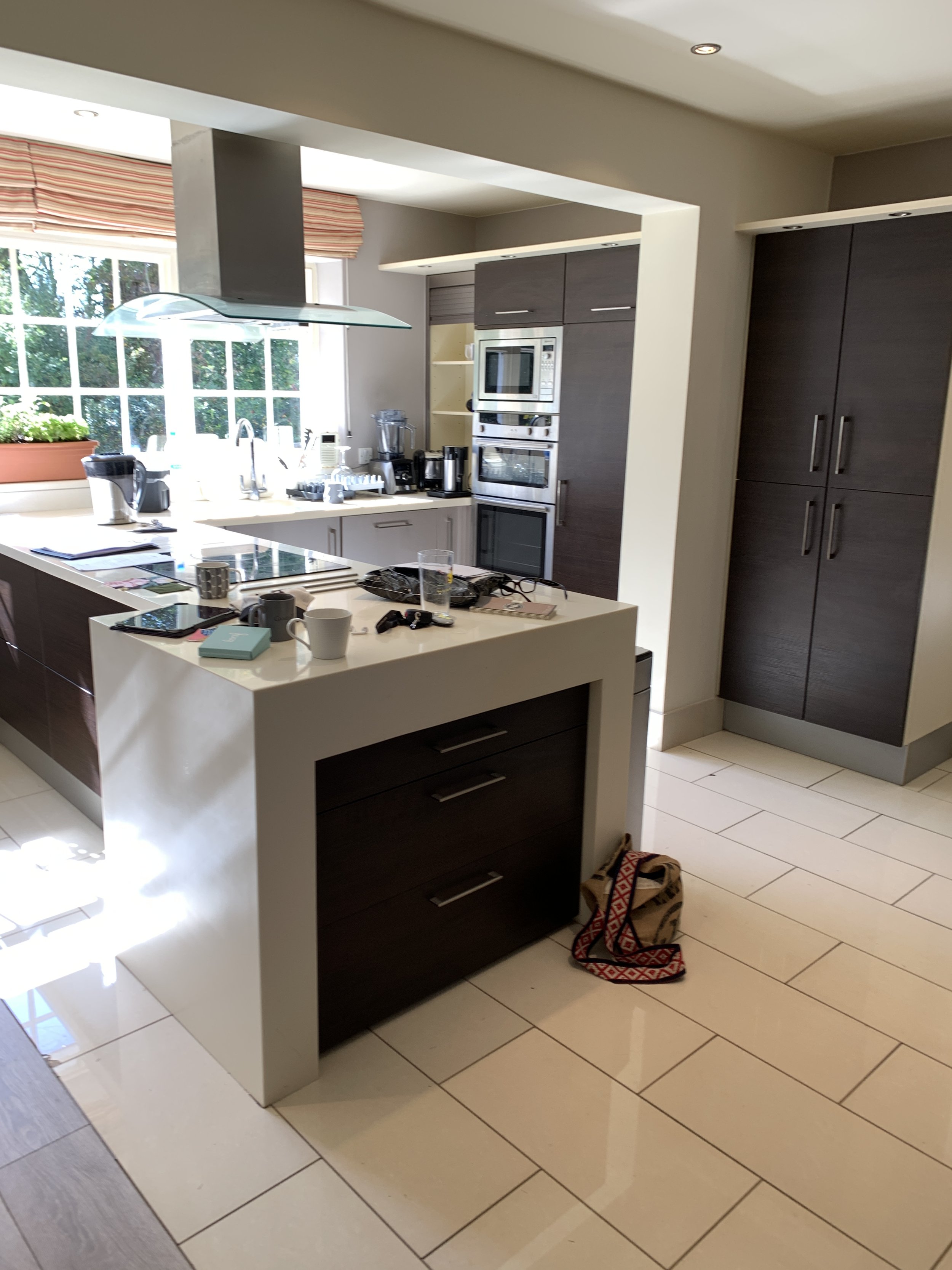
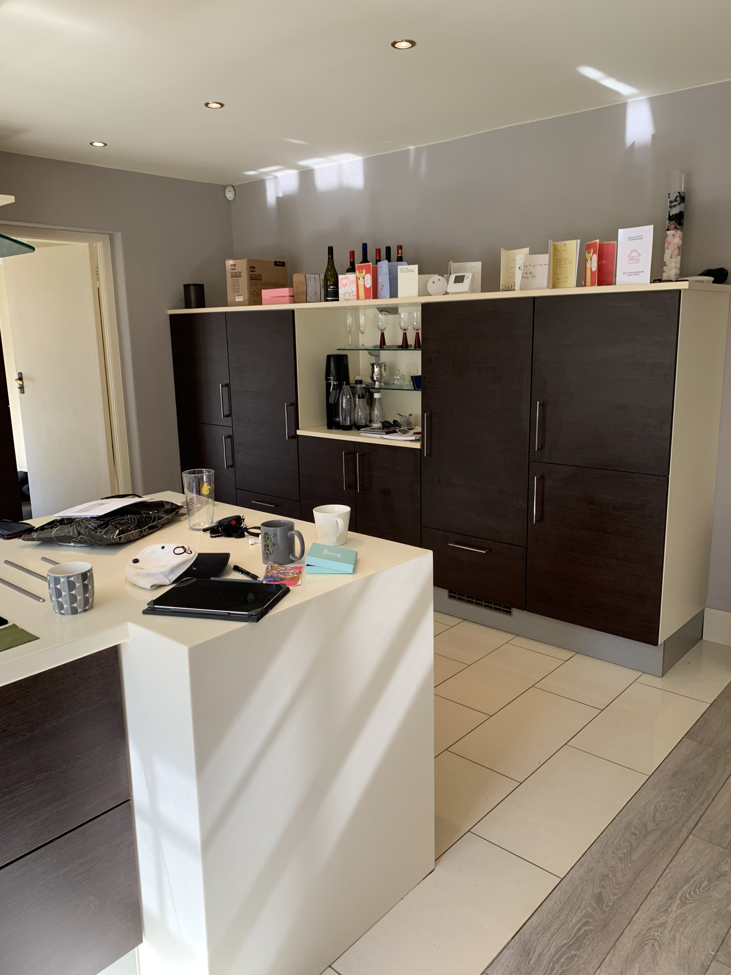
The layout of the existing kitchen felt awkward, and there was lots of wasted space. The cupboards were an odd height, with a large gap above them, which made the kitchen feel more enclosed . There was no ‘flow’ to the space, so with the help of a local kitchen designer, we worked on a design that would meet the needs of the family and also deliver the wow factor.
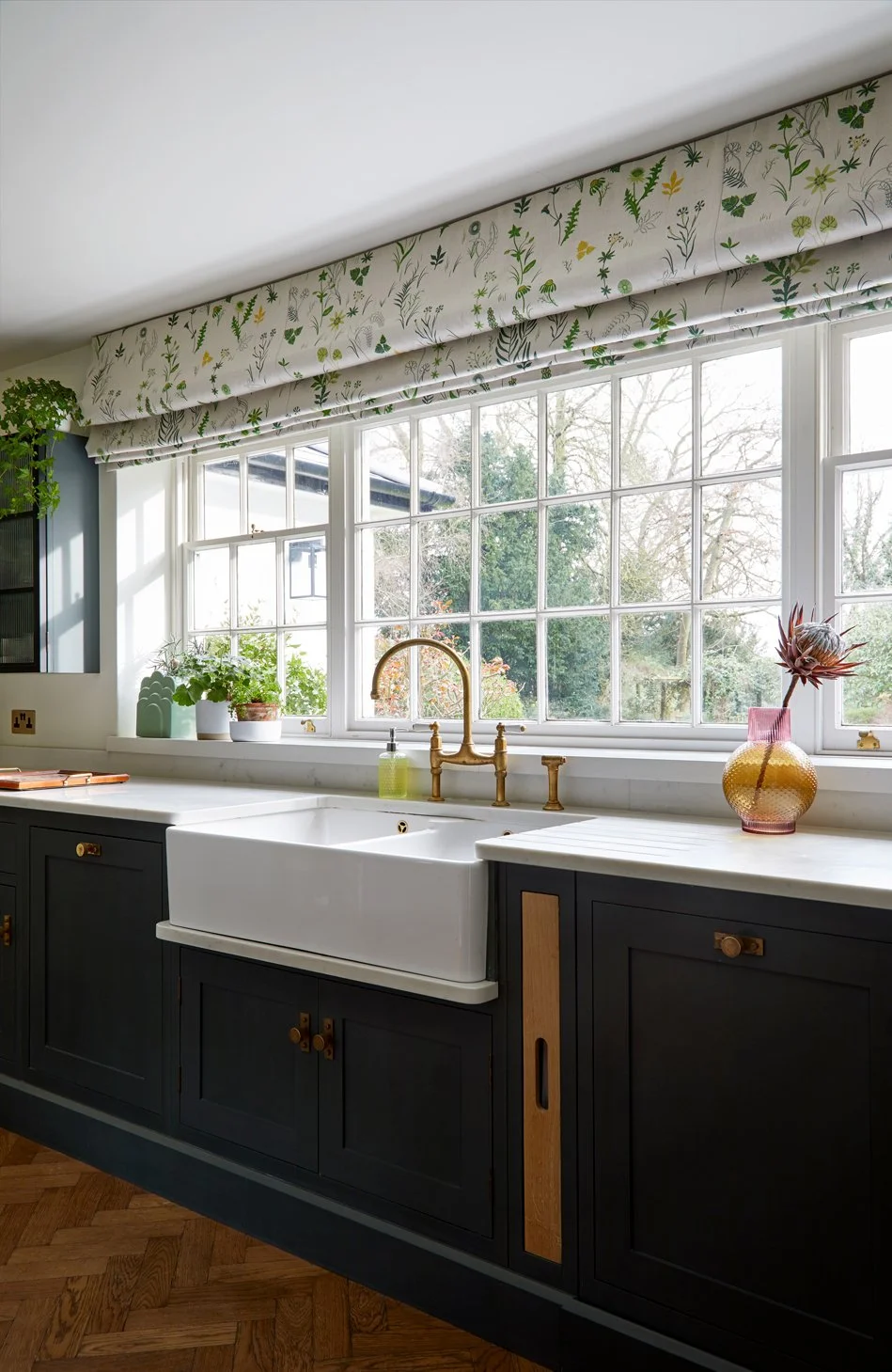
Room with a view, perfect for daydreaming when washing up
Linking the kitchen to the garden
We wanted the window to become more of a focal point so decided to change the aspect of the kitchen, adding a complete run under the window and placing the island parallel to it. One of the entrances to the house takes you straight into the kitchen (the one used most often) and so it made sense to draw the eye ahead, to the garden and the light.
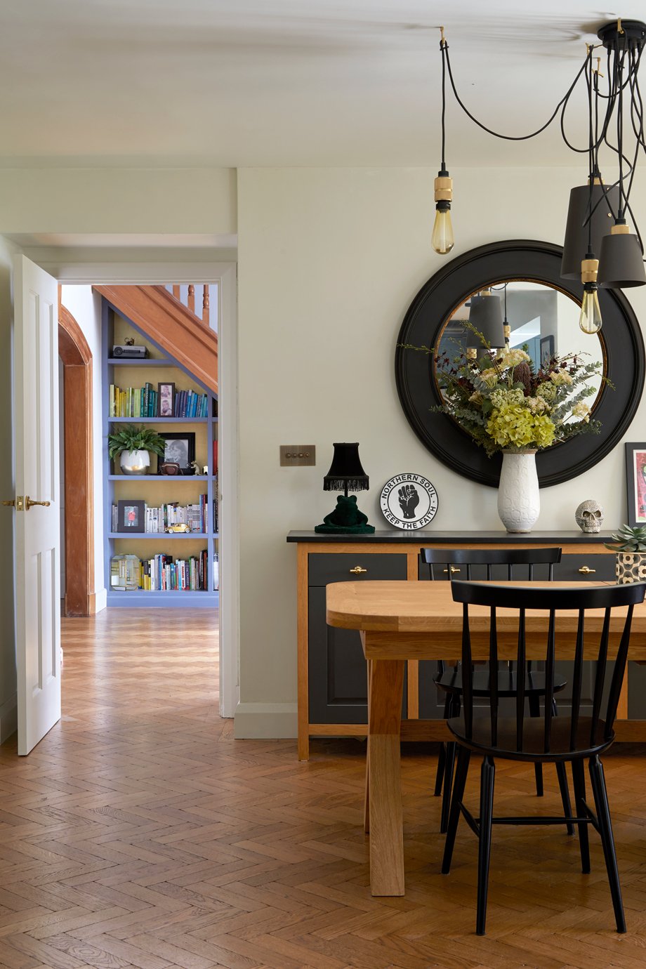
A stylish bookshelf provides plenty of storage for cookery books
Kitchen storage
Careful consideration was given to storage, as the family has a huge amount of crockery, pots, pans and cookbooks. Two 1000mm wide pot and pan drawers were incorporated into the island, a fabulous dresser cupboard houses the kettle, microwave and a large selection of teas and extra storage is provided in the dedicated cooking area.
The Everhot range cooker creates a stunning focal point
The range cooker
The stunning Everhot range takes centre stage on the opposite wall and became a feature in its own right. Two further sets of pot and pan drawers, a bespoke cooker hood and peg rails either side of the cooker dress the space beautifully.
The kitchen island
The island was coming in at just under 4m and this meant that we were going to have an issue with the quartz. Slabs tend to be 3m max in length, sometimes slightly longer, so this would mean we were going to need a join – not what we wanted. A permanent wooden chopping board at the oven end of the island avoided this and the change in material adds extra texture and warmth to the kitchen. The end result is a complete winner and the practical wooden board is used all the time for food prep.
The prep sink
Adding a prep sink in the island, for washing veg, complete with a beautiful brass, boiling (and sparkling) water tap were the finer details that really elevated this kitchen. In collaboration with the client and the kitchen company, everything was covered to create a practical, functional and beautiful kitchen.
The prep sink complete with a Quooker hot water tap
The kitchen design details
The colour scheme was carefully considered. Farrow & Ball’s Studio Green was used for the cabinets and cooking zone walls, the complementary warm tones of Slipper Satin were used for the walls and the woodwork was painted in Strong White. Field fabric from Christopher Farr | Cloth was used for the blinds, Carrera Quartz for the worktops and cabinet handles are from Armac Martin.
Aged oak parquet wooden flooring was laid throughout the whole of the ground floor, to provide a visual link between the kitchen, the large entrance hall and living room.
The proof of good interior design is not looking back at what we see as we close the door behind us, and thinking, ‘that looks nice’. It’s how the people in the home feel in the space for the weeks, months and years after that. Clients often become friends, and we love nothing more than being invited back for a cuppa. Receiving a glowing review really is the icing on the cake!
Client review
Initially I met with Alison to discuss a full design service for a couple of rooms however we loved her ideas so much she practically redesigned the whole house.
Alison is a thoughtful, creative designer with an amazing eye for colour and detail. Each room she has designed flows into the next creating a very beautiful yet functional home.
Alison considers every aspect of a design, from light switches to curtain colours to kitchen layouts. Throughout the project Alison spent time asking questions regarding our own style and requirements, this considered approach was then reflected in the excellent designs she presented at our meetings.
She took our ideas and concepts but then using her expert knowledge elevated them to the next level.
If you’d like to see more of our five star reviews, head over to our Houzz profile to read other comments that are lovely clients have made about us.
Find out more about our full interior design services to see how we could help you transform your kitchen.


