Harpenden Interior Design Case Study
Anyone who has ever undertaken a home renovation project knows that it can be both exciting and overwhelming. There are so many things to consider – from the overall design of the space to the specific materials and finishes. It can be tough to know where to start. This is exactly how our Harpenden clients felt. We had the pleasure of working with the family when they booked a design consultation to discuss their plans for a large kitchen extension. To build or not to build. That was the question.
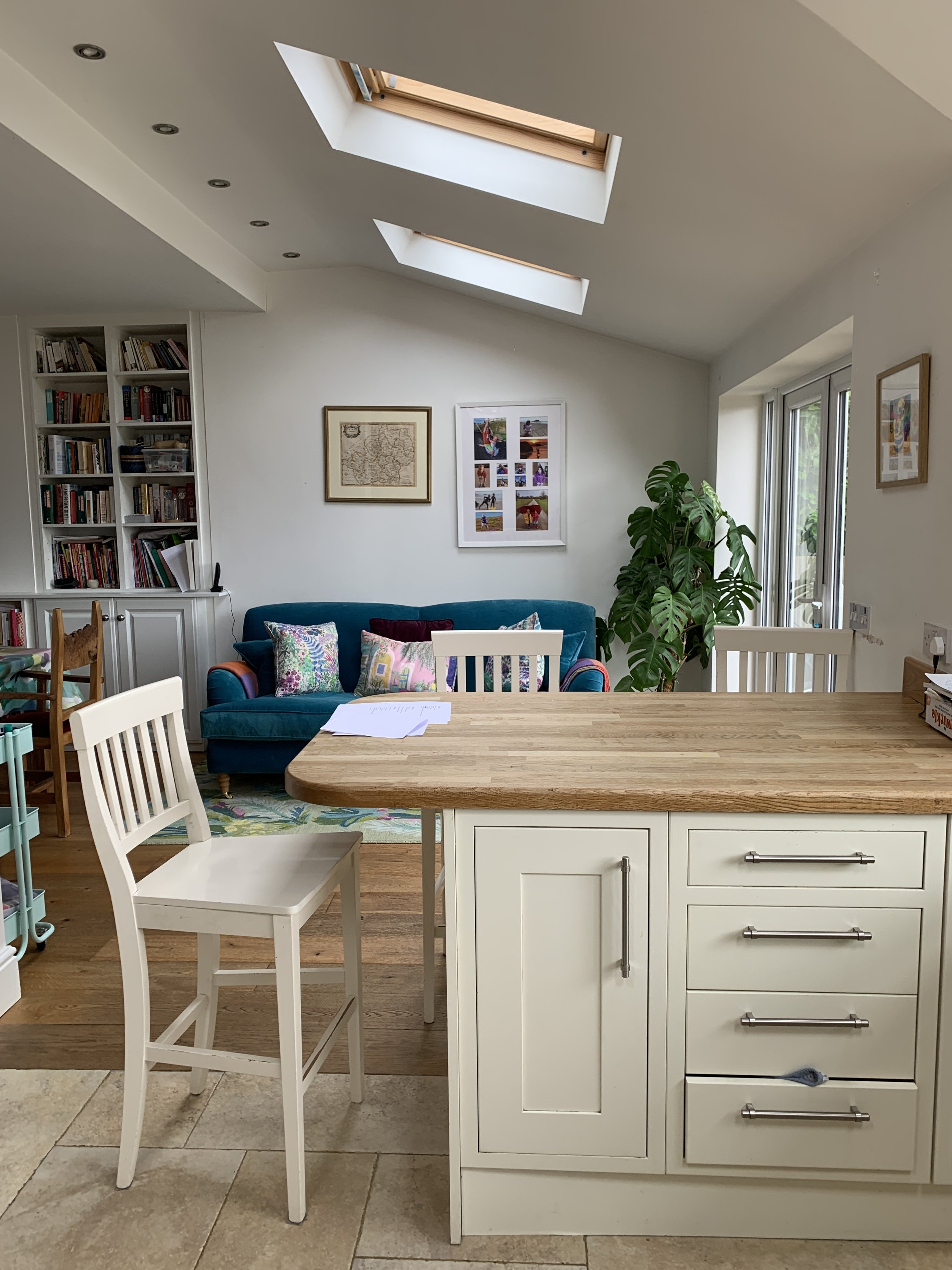
BEFORE AFTER
The initial interior design consultation
The appointment was centred around their concerns about the size and cost of their proposed kitchen extension. ‘Would it be wise to undertake such a large project?’ ‘Would there be a return on their investment?’ It was important for us to provide the clients with the right information so they could feel confident in their choices and see what would work best for them as a family. We were delighted with the review we received on Houzz following the consultation, “It was excellent to have a fresh pair of eyes on things as we had become a little frozen on how best to proceed with such major works!”
A few months passed and we were thrilled to receive a call to say that the family wanted to move forward with the project with our help. Following the consultation, they had decided to scrap the large extension, choosing to knock down the dividing wall between the kitchen and dining area instead and build a compact extension for the utility room. Along with the kitchen and utility, they also wanted us to design the downstairs cloakroom, hallway, landing, and the master bedroom.
BEFORE AFTER
The start to any interior design project
The first step was to gain an understanding of the family; what they hoped for in terms of the style and how they wanted each space to feel. We always ask lots of questions at this stage so we can dive into every detail. This information is then used to inform the design brief and design direction, so everything is tailored towards fulfilling the client’s wishes and aspirations.
The interior design brief
The family wanted their kitchen to be inviting, yet functional, so it could work as a place for cooking family meals as well as somewhere they could entertain relatives and friends. It was important that it felt bright, airy, and warm and had plenty of storage. Being North facing, the clients felt their existing kitchen had a coldness to it, which made it feel dark and uninviting. They wanted a dark blue or green colour palette but were concerned these colours might make the space feel gloomy and uninspiring.
We set to work…
We use digital mood boards to summarise our design concept and inform the design direction
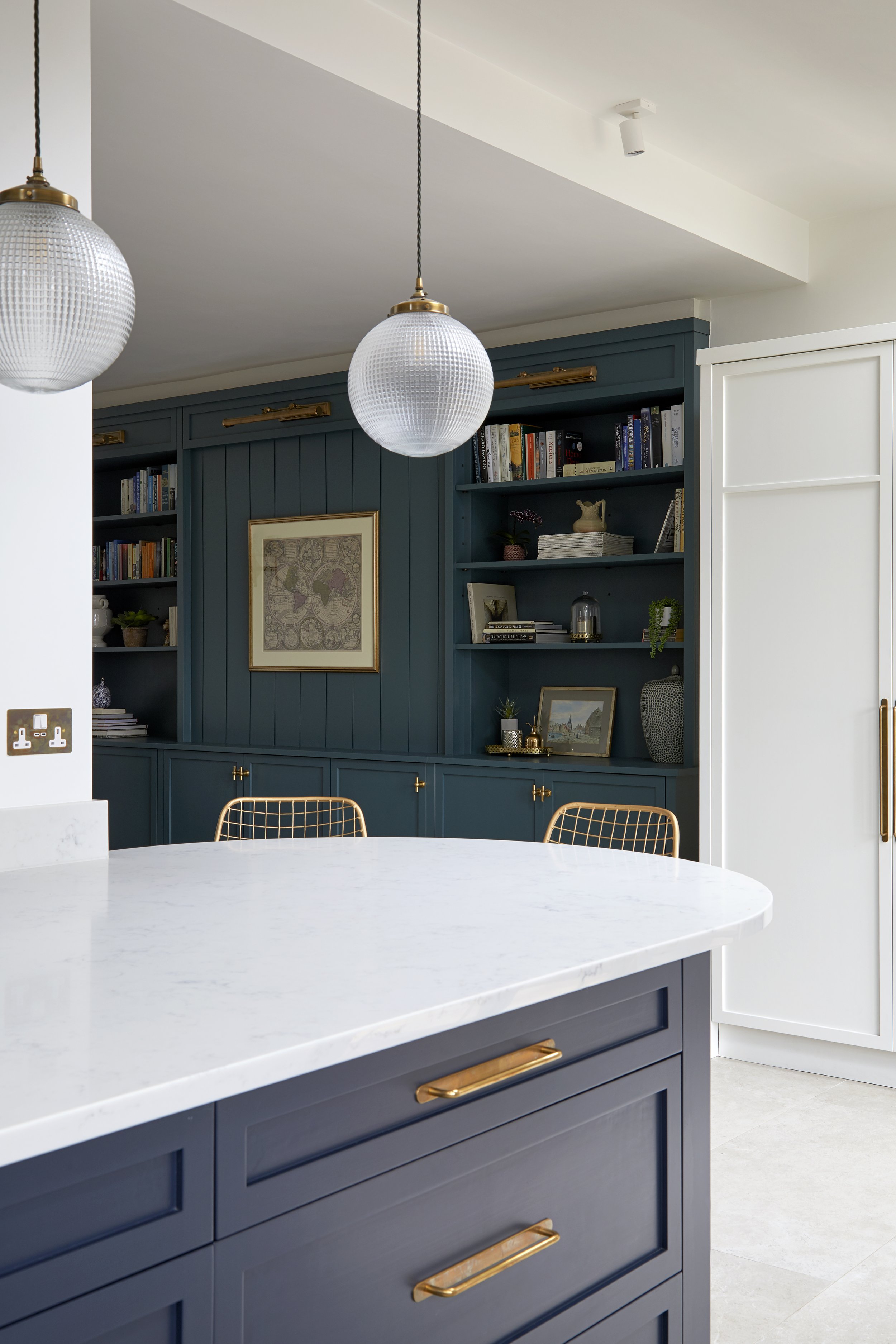
Bespoke slim framed shaker kitchen
This was turning out to be one of our favourite kitchens, and with such responsive and enthusiastic clients on board, we knew we were going to create something very special. The kitchen was made by Hertfordshire based company Teco Bespoke, in a slim framed Shaker style. This is a modern take on a classic Shaker design and has a fresh and contemporary look. For the flooring, we chose large format tiles from Mandarin Stone to draw the eye from the hall, through to the kitchen and garden beyond.
Dark blue Shaker kitchen cabinets with wall cupboards painted in Little Greene’s Slaked Lime, which is the same colour as the walls
Paint colours for a north facing kitchen
The base cupboards were painted in the deep, inky blue tones of Mylands Bond Street while the wall cabinets, pantry cupboard and walls were painted in Little Greene’s Slaked Lime. Sticking to the same colour on the walls and tall cabinets helps the units to disappear into the room. It also helps to distract the eye away from the angled ceiling.
Slaked Lime is one of our firm favourites. It’s part of Little Greene’s colour scales range so there’s a very handy and versatile choice of tones. With its warm undertones, this soft neutral works beautifully in both North and South facing rooms.
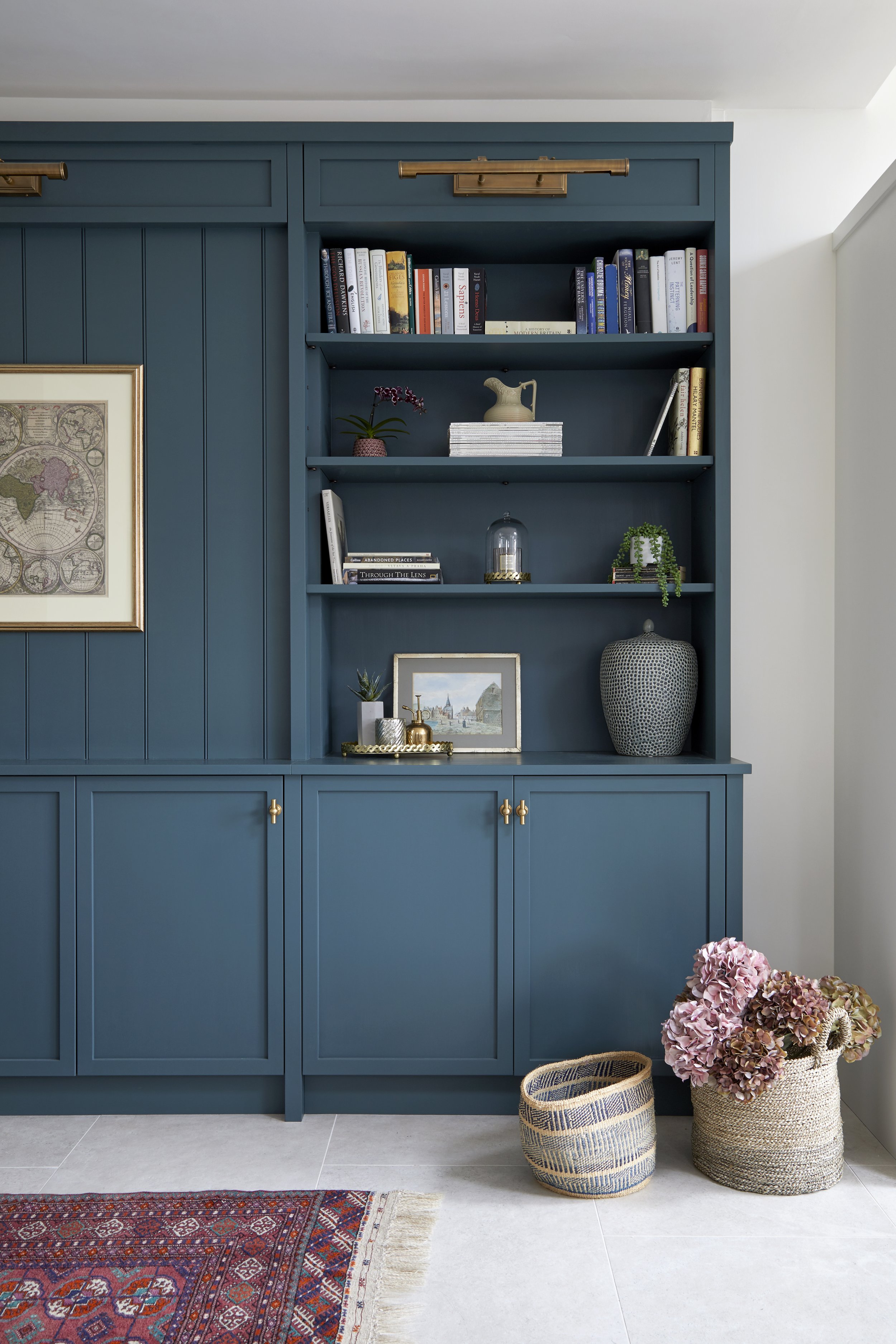
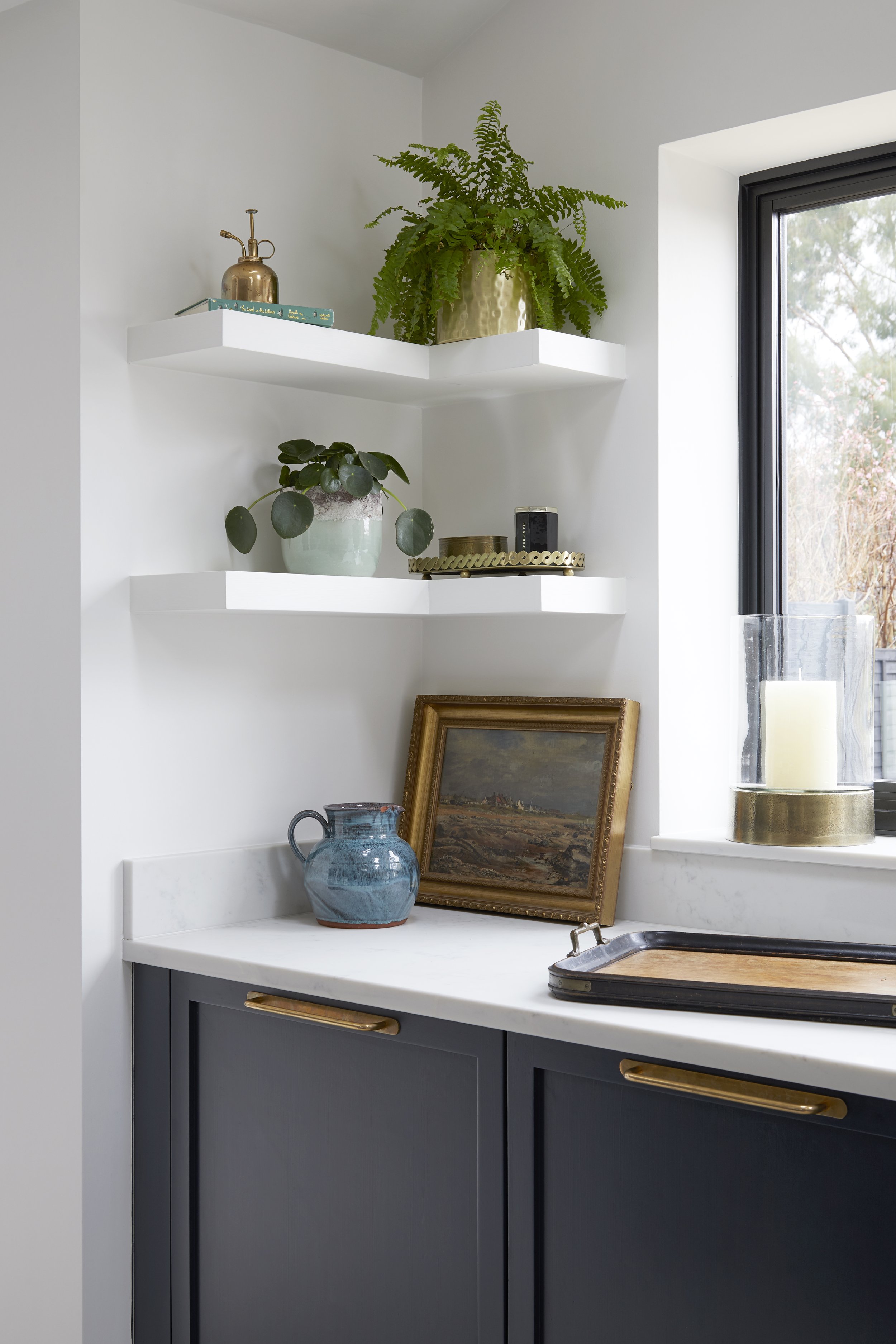
Alcove cupboards and open shelving
A bespoke shelving unit was made for the library area of the kitchen and painted in Farrow and Ball’s Inchyra Blue. This gives the fitted furniture its own identity and helps to zone the space whilst also complementing the other colours in the kitchen. Open shelving was added to the sink area to balance out the proportions of the window and provide a place for interesting displays incorporating plants, vases, and artwork.
Kitchen pantry cupboard
The perfect place for storing all your supplies, this cupboard is designed to be spacious. With plenty of drawers and shelves, it's easy to find what you are looking for. Bulky packets of pasta, tins and other dried goods are stored out of sight, while the bottom shelf provides a handy breakfast area, complete with a toaster and storage for tall cereal containers.
Kitchen lighting
As in all open plan spaces, it was crucial to get the lighting right. Due to the angled ceilings, we used surface mounted, adjustable spotlights as downlights, along with island, wall and pendant lights from Pooky. The lighting was used to zone the different areas and create the desired atmosphere according to how and when the kitchen, dining and reading area were going to be used.
The kitchen lighting plan features several circuits to create a layered lighting scheme and to zone the different areas
How to make a small utility feel larger
A compact extension created space for a new utility, a must-have in a family home, if the space allows. We knew this was an important addition to the home, so it had to be designed well. The utility is small, so tall cupboards were made to maximise on the storage and then painted the same colour as the walls to prevent them from dominating the room. A ceiling mounted clothes airer frees up floor space and the all-important sink, washer and dryer were placed on one run with a workspace above.
The dark frame of the utility door pick up and repeats the detailing of the main window above the sink in the kitchen. A reeded glass, crittall pocket door was used to encourage extra light into the kitchen and stylishly separates the utility room from the kitchen. If space is tight, a pocket door is a great solution as it means you don’t have to allow room for the swing of the door. Don’t forget that the wall must be wide and long enough for the door to slide into, when open.
Understairs toilet transformed
We had lots of fun with the downstairs toilet, with the design being centred around the gorgeous Ottoline Devries wallpaper. Dark blue panelling links with the kitchen and elevates an understairs cupboard from a cramped, uninspiring space, into something rather special. The light blue ceiling cocoons the space and is a step up from an unexciting bright white that is so often used by default.
This bold and quirky downstairs toilet has been designed for maximum impact
Master bedroom makeover
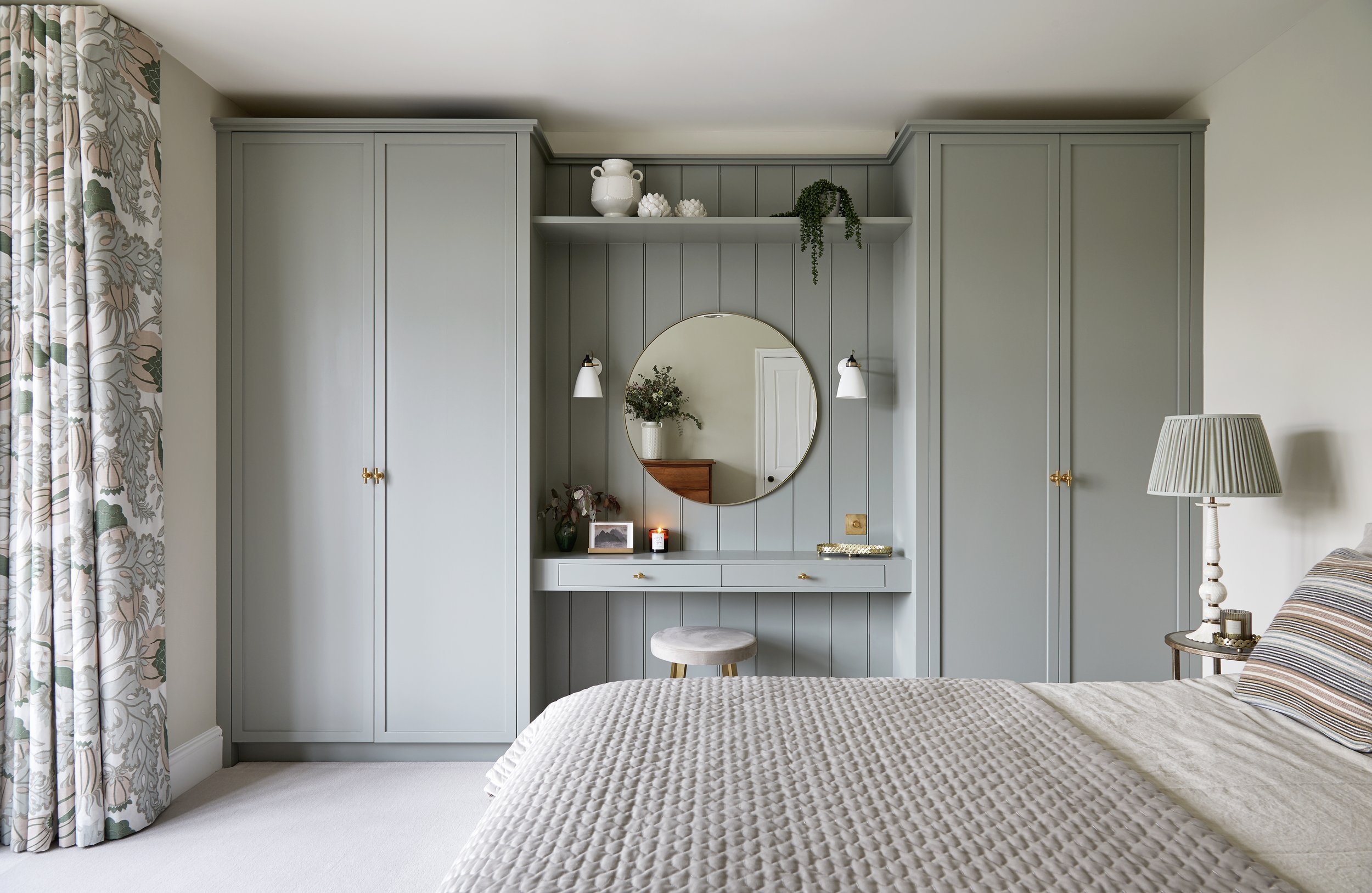
The design for the master bedroom was led by the rather wonderful Carnival fabric in olive from Christopher Farr Cloth, which the clients instantly fell in love with. This large-scale printed fabric was used for the floor to ceiling curtains in the large bay window. Sheers were used for privacy and to allow light to filter into the room and soften the harsh lines of the windows. The bespoke wardrobes and dressing table make the most of every inch of space and replace the old, freestanding versions. They have been painted in Farrow and Ball’s Pigeon, a blue grey which lends a soothing touch to the space.
The existing wooden bed was reused and dressed with striped cushions and a bespoke luxe, velvet bedspread. These additions add extra texture to the room, to give a layered, cosy feel. The result is a calm oasis that’s a sleeper’s paradise. The colour scheme of soft taupe, olive green and off-whites is effortlessly sophisticated and provides plenty of interest without being overpowering.
BEFORE AFTER
The master bedroom has been transformed with the new fitted wardrobes and dressing table
And that, as they say, is a wrap.
This was a lockdown project, so it did take a little longer than usual, but we think it was well worth the wait.
And thankfully, the clients thought so too…
Client review
Engaging Alison to help us through a substantial remodel and renovation of our family home was the best decision we ever made! Over the course of 16 months she transformed our home into a practical and beautiful space, and we are thrilled with the results!
Before commencing the project, Alison made sure we had a budget in place and provided advice on where to spend and save. As an interior designer she made sure the ‘bones’ of each room were perfect: layout, lighting, electrics, flooring, and cabinetry. Thanks to her expertise we avoided making costly mistakes and future-proofed our home by making good design decisions that will stand the test of time.
Alison created beautiful and imaginative interior schemes for everywhere from the bijou downstairs cloakroom to our large open plan kitchen-dining room and master bedroom. Alison was meticulous in her attention to detail and brilliant at sourcing everything we needed for the project.
On a personal level, Alison was lovely to work with: extremely personable, professional, and very focused on delivering an amazing result. Indeed, she really went above and beyond to help us create a lovely home, and we cannot recommend her services highly enough.


